Friday, 15 April 2016
Thursday, 14 April 2016
Evaluation Q6 Part 2
Additional programs I used in the making of my magazine
I also used PowerPoint, Microsoft Work, Prezi Slide Share and of course blogger when creating my magazine.
I decided to use various programs as I thought it would make my blog look professional and original to everyone else.
However, the main reason I decided to use these is because I knew the bases of each of them which made it a lot easy to do my research on.
PowerPoint and Microsoft Word were the easiest as I use them on a day to day basis. However, the only thing I didn't know on these programs where how to change the file to an image to be able to place on my blog. However, I soon learnt that you had to make it into a JPEG.
Prezi Slide Share was fun to use as it had features that the rest of them didn't. It makes my work look more presentable and in a way relates well to the music genre as it has different variations which music does too.
Evaluation Q3 Part 2 - Institution Ideas
Evaluation Q3
What kind of media institution might distribute your media product and why?
I feel as though my magazine would be best to be published by independent publishing company Q. This is because I feel the ideology of my magazine and of this company match more that similar magazines NME and Kerrang as they are different genres of music. Unlike Q, they base they're genre of music around indie bands.
Although I've used not used just Q as my main sources of inspiration for designing my magazine, I feel I want the ideology of my publisher to be this particular one as it's popular, successful and relates well to my target audience.
To me, it's obvious that a passion for what you're publishing is important when creating a music magazine. I would want my magazine to be published by people who know what indie music is about. If you're a fan of the music yourself, you're going to know what to put into the magazine. Furthermore, the ideology of Q matches the rebellious ideology of indie music; being independent, individual, and having a true passion for music.
Another advantage of having my magazine published by Q is that the other magazines they appeal to an older audience due to the genres of music that they focus on. This is good because my magazine is more likely to reach the older audiences that I want to sell to, but also because it won't be in constant competition with the other magazines that Q publishes. Although my magazine tries to appeal mainly to a younger, having an older audience gives it a variety. This fills the gap in the type of magazine that Q publishes, which would in turn be economically advantageous for the company as their sources of profit would be expanded to an older market.
Thursday, 24 March 2016
Evaluation Q2
How
does your media product represent particular social groups?
When designing my media product, one of my aims was to create a magazine that appealed to fans of all different kinds of indie music as I felt that music such as Arctic Monkeys, The Strokes, The Kooks, The Killers etc was all unrated in the music market for teenagers and younger adults especially which is why I decided that as my target audience. Additionally, it was important for me to represent them positively in the magazine. I did this by using stylish costuming and main artists who were of a similar age to my readership. These things present young people as youthful and fun ensuring that the product apples to my target audience. Moreover, I wanted to represent this age group as intelligent because often magazine targeted at teenagers can be quite patronising and have a negative attitude towards them. I made sure the text within my double page spread especially was sophisticated but informal enough to be suitable for teenagers.
I originally intended to aim my magazine at just the female gender but along the process I changed my mind. This was because my final product turned out with a balance of each gender with I did not anticipate. However, this ended up being a positive as it was easier to appeal more then one gender rather then create a product just suited to females. To represent girls positively in my product I chose a typically feminine colour of pink and used female models throughout my magazine. To represent boys I used dark colours and the main model for my magazine was male. Because everything in my magazine is focused on both male and females it portrays them as both as important as each other, successful and admirable, which is attractive for both gender readerships.
As I explored my social class and demographics research, my product is aimed at all class readers. I represented all class's positively through the price of my magazine, and the writing style, which I tried to make professional and sophisticated but also with a side of informality too. I wanted a price high enough to reflect the quality of the product, but low enough that it was affordable for everyone as the target audience are young and may not yet have any profession.
Evaluation Q1
In what ways does your media product use, develop or challenge forms and
conventions of real media products?
I used continuity by using a house style throughout my product;
I used similar font types in each product as it makes the overall presentation
of my magazine professional and consistent. Additionally, the fonts that I used
work well with the genre of my magazine being indie as the font is edgy and
wouldn’t be associated with genres of music such as classical.
I used the colour black, grey and light pink for my scheme
colours as it works well with the audience, attracting both male and female
which creates a bigger audience for the magazine, persuading more people to buy
it. I kept the colour scheme throughout each product in different sections as
it creates an even distribution which I feel will attract the target audience well.
The same artists are on my front cover, contents and DPS as
they are the main content of the magazine. I decided on the same people to
feature on each product as like the font type and colour scheme it is consistent
and creates a professional outlook on the magazine.
Continuity represents my magazine well as it keepers the
readers engaged whilst reading.
Additionally, with the house style being the
same and consistent it makes it easier for the readers to follow and understand.
An example of this is if a well-known artist is stopped on the front of a
magazine, it would automatically attract the audience to buy it. Additionally,
if they were to skip through the pages and see that continuity of that particular
artist featuring elsewhere in the magazine it’s going to persuade them more so
to read/purchase it.
Thursday, 11 February 2016
Monday, 8 February 2016
Wednesday, 3 February 2016
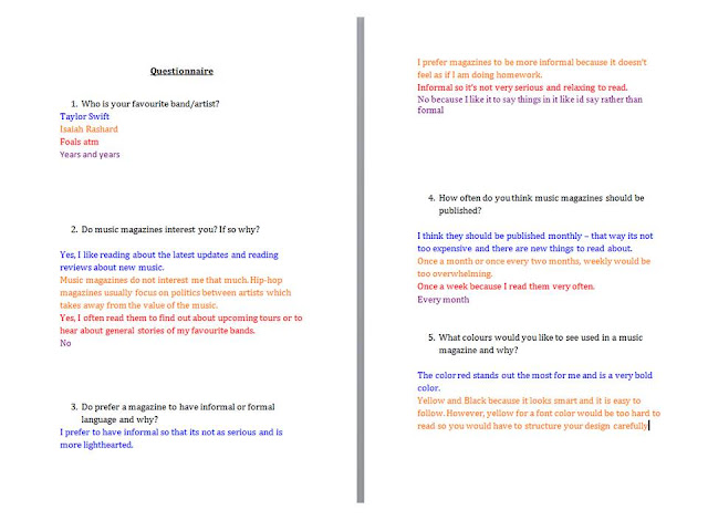
Questionnaire
I asked questions to a different group of people to find out what there interest involving magazine are. This helped me a lot when coming up with ideas for my magazine. Additionally, I chose to ask a different set of people as I knew the answers would be mixed.
Tuesday, 2 February 2016
Monday, 1 February 2016
Thursday, 28 January 2016
Subscribe to:
Comments (Atom)


